Roman Writing Systems
This page attempts to answer some important questions about the development of Roman writing systems. Click the link on any question you’d like to know more about to go directly to that section.
- What were the six major phases of script development?
- What kind of writing is on the Trajan column in Rome? Are dots used to separate words on the Trajan column? Was this common practice? Is the script legible? Why?
- What is epigraphy?
- Why was space not left between words in this early period of writing?
- How did the way that the pen was held affect writing?
- What scathing comment did St. Jerome have about Uncials? Why was Jerome irritated?
- After the end of the 6th century, how were Rustic Capitals and Square Capitals mostly used?
- How do the terms majuscule and minuscule relate to the Roman Square Capital, the Roman Rustic Capital, the Uncial, and the Semi- or Half-Uncial?
- What does it mean if a script is bilinear?
- What is the hierarchy of scripts?
Major phases of script development
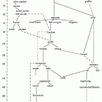
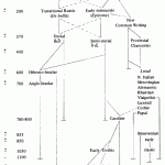
According to Ductus, “[s]ix main stages of development of Western handwriting are sometimes distinguished, though this suggests a neat and clear linear evolution which was not the case” (Ductus, “Preliminaries: Introduction”). Because script was not static, there were consistent developments in handwriting over time, so the phases of script development did not have a clear beginning or ending period. Ductus also mentions that script evolution would at times become so convoluted that people would attempt to return to a more legible script of the past. According to Ductus, the six major phases of script development can be (basically) summed up as the following:
- Roman writing systems, which has the following developmental pattern: Square Capital ==> Rustic Capital ==> Uncial ==> Mixed Uncial ==> Semi-/Half-Uncial;
- Pre-Caroline (7th to 8th centuries), which was comprised of “national” scripts, such as Visigothic, Lexeuil, Corbie, and Insular Minuscules;
- Caroline (developed around 800), which was developed at the Abbey of St. Martin’s at Tours and was greatly used throughout Europe;
- Protogothic (11th to 12th centuries), which was developed in England and moved into France, incorporating Anglo-Saxon Minuscule into the earlier Caroline script;
- Gothic (12th to 16th centuries), which included different styles that depended on the region or country it was associated with (Textura, Cursive Anglicana, Litera Hybrida, etc.);
- Humanist (from around 1400 onward), which helped develop modern European handwriting.
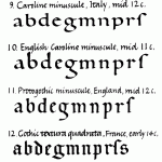
Click on one of the first two thumbnails below to see a larger view of each researcher’s individual “family tree” of script development. The third thumbnail includes a quick (albeit incomplete) view sample letters from the major scripts (T. J. Brown).
Trajan’s Column in Rome
The column of Trajan shows an excellent example of the Square (Quadrata) Roman Capitals script, which was often used when script needed to be carved into a monument of stone. This can also be called “scriptura monumentalis or capitalis monumentalis, a form of majuscular (capitals) used for larger architectural inscriptions.”These look a lot like what we used today for capital lettering, and today there are many fonts based on this type of script–and from the Trajan column in particular, as shown below:
As you can see from the image below of the inscription on Trajan’s Column, this script is highly readable, because the letters are squared, with straight lines, angular forms, uniformity in height across the line. However, Juan-José Marcos, a professor of classics in Spain, notes the “gradation in size from the bottom up. This is so that the letters all appear to be the same height when viewed from below” (p. 5).
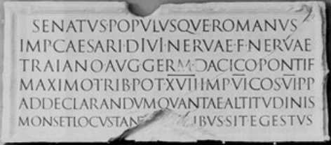
Inscription on Trajan’s Column (via)
On the Trajan column, the words (or their abbreviations) are separated by dots or points, called punctus, at the medial point of the line. This was a common practice during this time as a way to separate words, functioning “much like the modern comma, semicolon and period. […] In simpler terms, the punctus is a dot which can take on a variety of functions and sit wherever it wants to.” In this case, it is denoting an end to a word or abbreviation. In Ductus, the following is noted: “In de luxe manuscripts a medial or raised punctus was sometimes used to separate words in order to facilitate the reading of the text […] . The practice of separating words with space [‘aerated texts’] developed alongside the increased use of punctuation and abbreviated forms — an analysis of the scribal practice in using these three things can often be of use in the dating and localizing of a manuscript” (Ductus, “The Roman Writing System 1: Roman Literary Script and Square Capitals”, para. 6).
Check out this example from a plaster cast of the Trajan column. This sample of text shows you both the script being used as well as the punctus. See if you can find all of the punctus shown on the second line. (You can also see the same inscription on the image above, which may give you a clearer view.) If you are unsure where they fall, click the image to see a close up with the points highlighted:
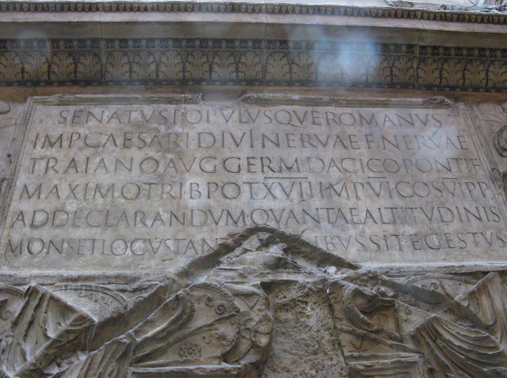
Cast of the base of the column. Note the script and the punctus. Photo credit: Silver Tusk / Foter / CC BY
Interesting information related to the Trajan column:
- National Geographic has an article that details the story of Emperor Trajan, which includes this amazing interactive graphic that helps you read the column’s circular tale.
- The McMaster Trajan Project includes more about the column itself as well as a searchable database of hundreds of images of the column.
- A more recent site by Roger B. Ulrich includes detailed information and more pictures of Trajan’s Column in Rome.
Epigraphy
According to the Oxford English Dictionary, epigraphy is a collective term for inscriptions, such as monumental inscriptions. It is also broadly used to mean “the science concerned with the interpretation, classification, etc. of inscriptions” and “often in a narrower sense[,], the palæography of inscriptions.” Here are a couple of examples of monumental inscriptions (click on the images for a larger view of the inscriptions):
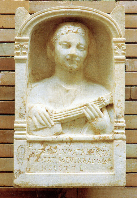
Photo credit: Manuel Ramírez – www.manuelramirez.es / Foter / CC BY-SA
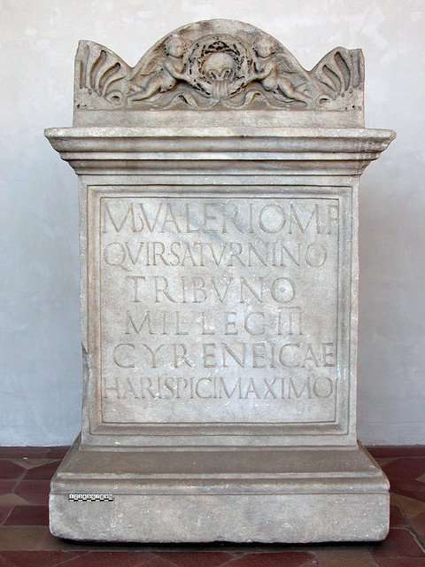
Photo credit: Manuel Ramírez – www.manuelramirez.es / Foter / CC BY-SA
Space between words
According to Paul Saenger’s Space Between Words: The Origins of Silent Reading (1997), space was not generally left between words when writing originated because society was in the midst of a more oral culture. Making reading easier or faster for “the masses” was not important at that point, because so few could read or had access to books anyway. As more people started reading silently instead of aloud (to oneself quietly or for a group of listeners, most of whom could not read), word separation began to spread throughout Europe. “The separation of words (and thus silent reading) originated in manuscripts copied by Irish scribes in the seventh and eighth centuries but spread to the European continent only in the late tenth century when scholars first attempted to master a newly recovered corpus of technical, philosophical, and scientific classical texts.” At times, however, a punctus could be used between words to make reading easier, particularly for writing on monumental inscriptions. (For more on the punctus, see the Trajan column section above.)
[Return to top]
Writing utensils & penmanship
The way that one holds a pen can greatly affect how the letters are formed, a fact that was just as true during earlier forms of writing as it is today–perhaps even moreso due to the structure of pens and the slanted “nibs” cut into quills or reeds. The angle that one holds the pen can affect how thick lines are or how much ink is being drawn from the pen to the paper. According to Simple Stroke Calligraphy, “you hold the tip of the pen at a 45-degree angle when you write Italic and at a 30-degree angle when you write Uncial” (Donley, p. 37). This works well with what we’ve learned in class, because Uncial, for example, has “broader strokes than other forms of Roman Capitalis, owing to the pen being held at a different angle” (Ductus, “The Roman Writing System III: Uncial and Semi-Uncial”, para. 3). This video below says told hold the pen at a 20-degree angle for Uncial, so there might be a bit of difference from one writer to another as to the exact angle.
Where one holds the pen and how firmly one grasps it also affects the way the line looks. If one holds a pen near the tip, the pen stands more upright and produces a thinner, sharper, more precise line. If one holds the pen further up the quill, the ink will flow better from the nib and give you a thicker line, because the pen is allows to tilt more and rest on the rest of your hand instead of standing upright (Lowe, 1999). As the video below shows, the pen is being held at a precise angle, and the letters are drawn short strokes at a time (instead of single strokes for each letter, without the pen leaving the paper). This still produces a different look to each line, depending on the direction the pen is being pulled based on the angle it’s held.
St. Jerome & Uncials
Many researchers believe that the term “uncial” originated from St. Jerome’s preface to the Book of Job (in the form of uncialibus). At the time, St. Jerome wrote the following: “Habeant qui volunt veteres libros, vel in membranis purpureis auro argentoque descriptos, vel uncialibus ut vulgo aiunt litteris onera magis exarata quam codices,” which has been translated as “There are people who want old books, either in purple-coloured parchment with gold and silver letters, either in uncial, as it is vulgarly said, which are more burden than codices.” It appears that he is commenting against the overly-decorative (“onerous,” perhaps?) style of writing and decorating writing, using larger letters and taking up a lot of real estate on the page. Some researchers believe that St. Jerome was railing against a newer style of writing, perhaps one that was overtaking his preferred manner of writing: “He does not mention the common and established capital writing in black on uncolored parchment or vellum, because it is not in point for his purpose: that style is dignified, but not ostentatious” (Merrill, 1916, p. 454). Merrill explains that St. Jerome preferred accuracy and correctness over ornate or beautiful writing.
[Return to top]
Rustic Capitals & Square Capitals after the 6th century
According to Ductus, Rustic Capitals and Squire Capitals “were used for main texts until the end of the sixth century; after this they are mostly used as display scripts for running titles, titles and in rubrics and chapter headings” (“The Roman Writing System I: Roman Literary Script and Square Capitals”, para. 4). Powell’s Medieval Studies: An Introduction states that Rustic Capitals were “used as a deluxe text script through the sixth century and for centuries longer as a script for titles and other special purposes, being especially popular in Spain” (p. 11). He goes on to explain that it was also used in England in the eighth century and in France into the Carolingian period for prefatory texts. The site Medieval Writing explains that Square Capitals were revived as headers and title text during the Carolingian era.
[Return to top]
Script progression: majuscule & minuscule
Ductus explains that majuscule are generally what we think of as uppercase letters due to the letters all having the same height between the same head (top) and base (bottom) lines. This is also called bilinear script (see below for more information) due to the head and base lines being the (often invisible) lines by which this is measured. Minuscule scripts, however, have letters of a varied height, with some having ascenders (portion of a letter that goes above the main body of the text line) or descenders (letter portion that goes below). This is often called quadrilinear (or quattrolinear) script due to the four main “lines” that the letters of a line of text may be contained within. For example, an m will stay within the main line of text, but a b has an ascender above that line and q has a descender below.
Roman Square Capital, Roman Rustic Capital, Uncial, and Semi- or Half-Uncial scripts show us a kind of progression from a true majuscule script to a true minuscule script. According to Dr. Linda Main’s “Scripts” lecture, Roman Square Capital scripts are also often called Quadrata or Majuscule, because the letters are all capitals and look somewhat squared off. She goes on to explain that Roman Rustic Capital script is the next progression of this lettering, as the characters become a bit smaller and less severe (more rounded). In additional, the idea of ascenders and descenders is beginning to take shape in the Roman Rustic Capital script, which also starts us toward the idea of a serif script (although that term wasn’t used until centuries later). Still, however, Roman Rustic Capitals have the characteristics of a majuscule script.
Moving onward, the Uncial scripts were “like rounded square capitals” (Main, “Scripts” lecture). Looking at these scripts, we again see the continuation of a generally uniform height with some letters, at times, going above or below the general height or base. Although we are breaching the head or base lines at times, the letters are still capitals and fairly uniform in height, so they are still considered majuscule script. And finally, we arrive at Half-Uncials (also called Semi-Uncials), which were smaller and more joined together (the beginnings of what we consider cursive writing as opposed to print). “Now these Half-Uncials were called minuscule scripts, smaller scripts, and they were typically written between four ruled lines rather than two,” because they weren’t just all upper- or lower-cased, but rather a combination of the two. The lowercase letters, especially, would have obvious ascenders (e.g, on the l, b, and d) and obvious descenders (e.g., on p, q, and g).
As the scripts progressed, scribes moved from using two ruled lines to use as a measure of where each individual line their text would go (such as for the Roman Square Capital script) and started using four ruled lines (for the Half-Uncial script). Ductus mentions that the first three scripts were basically bilinear with visible movement from rigid heights (in the Roman Square Capitals) toward the subtle use of ascenders and descenders (beginning in Roman Rustic Capitals and continuing with Uncial script), which finally leads us straight into the quatrilinear Half-Uncial script.
[Return to top]
Bilinear script
According to Ductus, bilinear script is “mostly confined between two lines of ruling” (“Glossaries: terms”). An example of bilinear script is majuscule (letters with even height). Our capital letters are for the most part an example of bilinear lettering: EACH LETTER IS BETWEEN TWO LINE S (albeit usually imaginary ones these days), without ascenders (above the head line) or descenders (below the base line).

Example of bilinear script with header and base line. (Typeface is called KG Primary Penmanship by Kimberly Geswein.)
Hierarchy of scripts
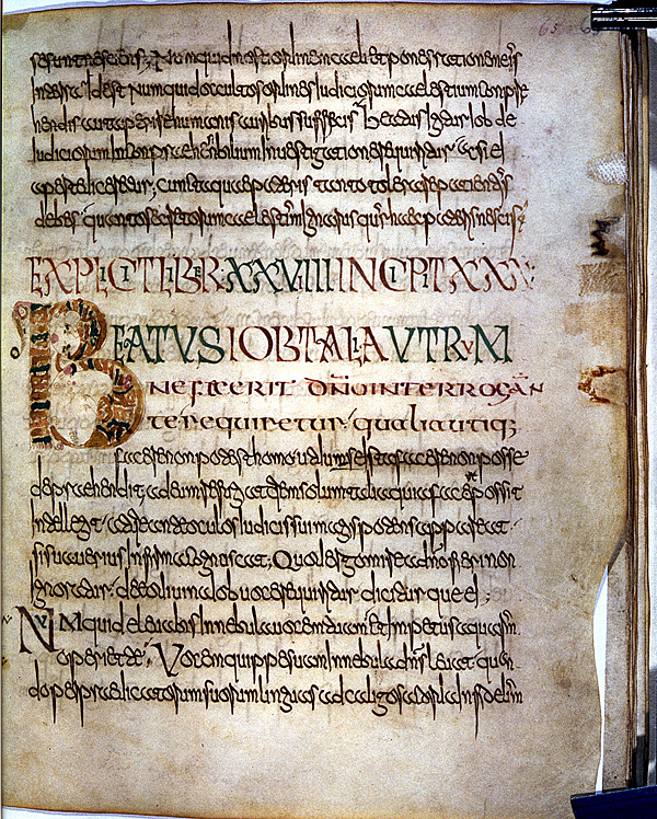
Ductus has the perfect definition “hierarchy of scripts”: “The sequence of script types used in presenting a text and its headers and titles; a typical arrangement is Rustic Capitals for the running title, Uncials for the chapter titles, and a regional script (e.g. Luxeuil Minuscule) for the main text” (“Glossaries: terms”). This is something that we commonly see in books, magazines, newspapers, and websites** still today: text will be a certain typeface with the headers or title are often another typeface. Check out the examples below.
This one is from Ductus (D-024). Note the main text in Lexeuil Minuscule script. The larger scripts are Rustic Capitals (largest) and Uncials (mid-sized).
For a more modern example, check out this web page from Mir Kamin’s blog, Woulda Coulda Shoulda. She is using a sans-serif typeface for the titles and a serif typeface for the basic paragraph text.
**I personally love to use a serif typeface for titles and headers with a sans-serif typeface for paragraph text. This site, however, uses Georgia typeface for both the header and the paragraph texts. The menus, however, use Lucida Grande–as would the title text, if I hadn’t chosen and uploaded my own title image, using instead a typeface called Carolingia, interestingly enough. Instead of setting off the headers with a different typeface, I use a different color and/or a different text decoration: h1 is the largest, bolded and underlined; h2 is a bit smaller and in red.
[Return to top]
